Sunday, 28 October 2007
Research materials for class exercise
Through the lesson about process of design, I have found something about the sun - my part for class exercise.
In Egypt, there is a sun god named Ra. This is his image from the site http://images.google.com.vn/imgres?imgurl=http://www.stencilkingdom.com/images/designs/egypt41_large.gif&imgrefurl=http://maya.learnerblogs.org/2007/03/14/social-studies-egyptian-gods/&h=500&w=277&sz=40&hl=vi&start=1&tbnid=GxqPJbR6txSWUM:&tbnh=130&tbnw=72&prev=/images%3Fq%3Degypt41_large%26gbv%3D2%26svnum%3D10%26hl%3Dvi%26sa%3DG
This is my first draft of the sun symbol. I like the idea that there is a snake cover the border of the sun.
I took the photo by cell phone camera so the color looks awful.
Maybe I need to change something later.
Saturday, 27 October 2007
Grass - 2nd entry
Hi all
As I said before, I really like something involved in nature or environment. Hence, this time I would like to do some work related to that matter.
I find out that grass fields at RMIT university are really nice and beautiful. That gives me an idea to create a word having a grass appearance.
In Photoshop, I created word in Arial Black. The reason is Arial can be considered as the typical font for displaying on the screen. It is believed that with san-serif fonts, our eyes are likely to read faster and easier on display units.
In a new layer, I used Brush tool with Grass and filled the word with "grass" like the image above. I chose the green color for foreground and the less light green for background. Therefore, the grass looks more real and naturals.
After finishing, I deleted the background layer and I had my own work:
Now the word "Grass" really looks like the natural grass.
Cheers.
My 1st entry - red tulips
Good day
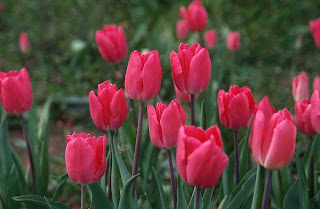
I am really interested in nature and wild life. Flowers are one part of the nature and environment. Everytime I look at the flowers, I feel really safe and sound, really peaceful.
This is the photo which is royalty free from the address: http://www.bigfoto.com/themes/nature/flowers/red-tulips-b6.jpg
The pink color of the flowers really helps to make the photo smooth, soft and somewhat delicate. That, in fact, impresses me a lot. That is also the reason why I chose this photo among a lot of flower images.
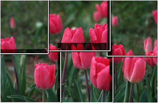
Then, I used photoshop to manipulate the image so that it can look nicer and more impressive.
At first, I used Marquee Tool to select an rectangular area of the image like this.
Then I saved the selected area as a new layer. I made more five layers which coverd all of the image. Next, I deleted the background layer.
After that, I edited one of the layer with Blending Option
-Drop shadow:
Blendmode: Multiply
Opacity: 100%
Distance: 5px
Spread: 35 %
Size:15%
Angle: 120
With stroke: I also edited some figures like:
Structure: Size: 5px
Position: Outside
Color: White
Then I applied the change for all of the rest layers.
Finally, I edit each layer (Ctr+T) to make it cover all of the image.
And this is my final work:
I like the way the whole image is divided into small pieces, but if still looks approximately as the original. Thanks for reading.
Subscribe to:
Posts (Atom)