Sunday, 25 November 2007

Logo for dating website - 10th post

Hi all,

This is the logo I made for Global Dating Website (one of my assignments for Web programming)
I made it with Illustrator.

I chose the Comic San MS font. The reason is that, firstly, it is better for displaying on screen with a sans serif font; next, it looks cute and appropriate for the words.

I chose one of the red colors for it. As we know, red can represent love, attractiveness, warnings or other "hot" stuffs :) . Hence, looking at the red word, people may feel more interested in finding their spouse.

The heart image is from: http://www.hostingandtoasting.com/my-love-heart.jpg

As you see, the heart shape is between the two words. In the photo, there is red love heart hold by two hands: one of the guy and the other belongs to the girl. So romantic! I wonder if I can find a half of my heart as this image.

Good bye

Relaxation - 9th post

Good day, all

This time I would like to do what Maddy told us in class about choosing one word with different font displays.

Today, I am a little tired. This week and next week, I have 3 assignments and 1 midterm exam. I wanna to be crazy. Can I survive after these two weeks? Maybe yes, I hope.

What I really really want to have now is the "luxurious" word: Relaxation

Here is the first font I choose: Brush Script Std Mediur
When looking at this display, I can feel a little relaxed. The reason is that it is italic form and is a sans serif font. It means it does not look too formal.

The 2nd font I choose is Giddyup Std

Oh, I really like this font. It is so cute, so nice and so pleasant. Another type of sans serif font. The way how it was written makes me feel that I am gonna to have a nice holiday at the beach.
I should give up everything and do it now?

This is my final choice with the font Mesquite Std Medium

How can I feel less stressed when seeing this ugly pattern. It is too formal like a cautious, warning message. It scares me. I want to be crazy now with this font. Really messed up.


Sunday, 18 November 2007

Dealing with something about collage - 8th post

Good day, everyone
This week, Maddy also gave us some extremely helpful tutorials about dealing with collage. These are some of my works created as following her lecture in class.

Using layer with different clouds:


This image was archived when I mixed the eye image from Black Board with a new different clouds layer. It creates an effect blurring the eye sight. This gives us a feeling about time passes. The clouds can represent the movement of time.


Using gradient map:

I created a new gradient with the two color: light purple and light gold. When adding the gradient to the photo, I had this image. The purple and light gold colors often give us the feelings of old time, good things in the past. I really like the eye in this pattern of color: a little sad but not so pessimistic. It seems like someone remember about his or her good time in the past, but now everything has changed.

Lighting effects:
I made this image by creating a new different cloud layer. Then, edited the layer with lighting effects and applied the light green color to it. When using overlay pattern in layers, I had this odd image. The green light and cloud pattern make the feeling of unsafety or a little danger in the vision. Hope that you like it.

Good bye.

Saturday, 17 November 2007

Mixing players - 7th post

Hi all

This week, Maddy taught us in class about working with layers. As she said , we should keep some of the mixing photos we like. Hence, I would like to show some of my interesting works.

I used the two photos on blackboard in Blends folder to deal with the practice.

1)Darken mode:

This is the pattern I like the most. The reason is that the eye image does not appear so clear or so blur. It is just enough to make the impression. The whole stair in the original one still looks clear and sharp. The big eye above the black stair and between the two black walls really fits in the photo. Moreover, the green leaves spreading through the eye lip contributes to make the image nicer. It gives me the thought about the eye of time.

2)Hard Light
This image is completely different. The eye takes the whole sight, and the stair and the walls just look like the blur background. This reminds me about the memory each of us has last in our lives.

3)Exclusion:


This pattern of mixing is absolutely strange. The colors might have been "excluded" in some ways. As you see, the upper part of the eye still remains the shape and we still recognize it. However, at the lower part, everything looks more blur and not evident. It gives us a feeling that this eye comes from another world, another place, not on earth.

Thank you for spending your time reading this post. Cheers.

Sunday, 11 November 2007

Gestalt exercise - 6th post


Good day, all.

This is my work for gestalt exercise. As Maddy said in class, "it is better to have a large and beautiful image than using hundreds of small photos". Hence, I made the photo bigger and fit in the top of A4 sheet.

With the title, I choose the red color for the phrase "Sex Life". The reason is that red is more attractive and impressive. I applied the dominance principle. In comparison with the other words of the title and the whole block of text below (all of them are in black and with the same font), the "Sex Life " phrase really points out. I also used a descriptive font for that phrase to make it nicer and more "charming" to the reader.

For closure theory, if you look carefully, you will recognize that each part of the title helps to divide the whole photo into small rectangle. This is my intention. Also, for continuance, I set the title words from top to bottom, from left to right to make it easier for readers to read.

Hopefully it really works as a poster or layout. Cheers.

NB: There is a problem. I do not know why the photo exported from Illustrator looks wrong like above. It has more margin on the right and the bottom is cut out. In Illustrator, it looks normal and fit in A4 portrait size. Anyone can give me help?

Wednesday, 7 November 2007

Logo for woods protection - 5th post

Good day, all.

This time I would like to practice something in Illustrator. In fact, for me, Illustrator and Photoshop are "new" because I just know few things about these two programs. Hence, I decided to take some tutorials from Illustrator. Learning basic and simple things from the beginning is what I am trying to do now.


At first, I created a circle and then chose a symbol from Symbol pallet. As you know, nature in general and forests in specific have been destroyed and damaged a lot recently. That gives me an idea to add the symbol representing woods to call for protection this element of nature.

Then, I filled the circle with red color. The reason is that red can make warning and cautious meanings. I want people to pay attention to the problem about deforestation.


After creating the logo, I thought if might look better to add one more border to the circle. Therefore, I added the yellow border to the red circle. Next, I would like to give some text to the original logo to make it have more critical meaning.

The phrase I selected is "In danger" and the desired font is Viner Hand ITC. As you see, the font type really make impression to the image.

Hopefully you like it. Cheers.

Saturday, 3 November 2007

Color and tone correction - 4th entry

Good day, everyone.

This is another photo that I would like to keep and manipulate when I seeing it on the internet. This image is royalty free from the address underneath: http://www.bigfoto.com/themes/nature/forest/forest-01.jpg

The whole landscape is the sight of a dark forest. Yes, of course, it is a dark forest, so some of the trees are in black shadows. And if we let it be as its origin, everything will be like that.

However, I still want to add more contrast to this photo, so that the objects (the trees and the grass) look more lively and active, like in the sunny day.

I just used the simple tool. I opened: Layer > New layer Adjustment > Levels:


From this panel, I can add more brightness or contrast to the original image.


At first, I changed the highlights and shadows by adjusting the black and white small triangles. And this is what I had:
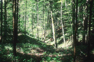


As you see, now the photo looks brighter and more lively. In the center of it, the sun light seems to be more widespread and warmer. Now, I think the image should be sunny woods, not dark forest. Miracle matters! We just need to add more contrast to an dark photo and we will have some interesting effects.


Then, with the original photo, I used the Set Gray Point Eyedropper tool instead of adapting highlights and shadows. And here is what I achieved:
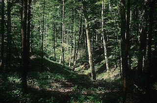


This manipulated image does not look really lighter than the modified one above. Nonetheless, it can be considered more natural and not synthetic. It just be a little brighter than the untouched one. However, we can see it is more contrast and active. The light is really bright and gives us a feeling of heating. There still be dark areas in this image, but it is balanced with the light sections.

To sum up, if you want to make your photos more lively, just need to add more brightness or contrast to them.

Cheers.

Colored Pencil & Cutout effect - 3rd post

This time I would like to do some basic and simple things with the image I found royalty free on the Internet: http://www.bigfoto.com/sites/galery/nature1/natur001.jpg

When I have a look at this photo, I feel pretty safe and sound, somewhat relaxed. However, the sunset landscape also gives me a little blue feelings. Maybe the reason is that everything in that image is so quiet, so static. Moreover, the dark colors also makes the photo look more silent.

This image can be considered an example of monochromatic with the values of color varying from white to black. Or it can be thought of analogous as well if the clouds are blue darks and the light are extremely light red. It depends on our perception.

I do not want to do complicated effects on this image. I like simple matters. Hence, I just applied the colored pencil effect on it at first.


Now, we have the manipulated photo. It looks kind of impressive and nice. I thinks it can be considered as a painting. The clouds and black shades of the objects in the original one now turn into grey. The sunset lights still look clear and now more contrast on the gray background.


Then, I used the cutout effect on the original photo. And here is the result. In this image, the objects look more real but not too real to be a photo taken by a camera. The clouds change to black. It modifies the whole sight below (the house and the trees). The lake now is a little dark. We can still recognize the sunset light spreading through the whole image.

In conclusion, I think we can use these two effects on the image that do not contain many color to produce a photo looking like a water - color painting.